SCI-ART LAB

Science, Art, Litt, Science based Art & Science Communication

Dear friends
Biotical Art is in experimentation.
  Your are the first organized group with which I try to check the possibility of communication the techniques that we developed.
If they fail, I'll quit.
 Please help me and ask me about the confusing text.
Please bear account of the fact that any new means and effort
of  adaptation.


Please help me and pointing commenting on some heresy
  I submit discussions vector:

Utility, Needs, Satiety
  which I try to justify my proposals  to inserted into fine art

 a series of technical mean.
See on discussion copy of on my blog recently:

Psychical satiety in affectivity


Will also send a text which I have published in.

 Iliescu Liviu; Blue breezes, "Arta" (Bucharest), no. 9-10, 1990 page 25 .
         (Link)  Blue breezes

This text confirms Krishna 's action to bring the art of literature.


Some thoughts on light

Some thoughts on light


Bioptical Art - Liviu Iliescu


(Letter to Theodor Redlow who asked me 
what I feel when I look at a candle flame)

     I have discussed you observations on the range of colours in a candle flame based on my technical knowledge as an engineer. Invited to provide some considerations on intersection, I shall try (in a somewhat "alchemical" manner) to voice certain opinions which might entail discussions on other subjects. This theme - the same as others in the field of visual arts, which are close to sciences - permits explorations with the fascination of mirages resulting from suggested indistinct definitions. These are related to the nature of soul, more than to the compulsory precision usually require by explanations of the physical world.
I'd like to share the feelings of the "possessed" alchemists who used to mix up both of substances from the physical world with pagan prayers learned or revealed to their souls from the beyond. 
     I'd like to live the mystery of flaring embers, with violet flickering, the moving fluids on cave walls, in nights with rainfalls and distant thunders, the light slumbers and frightened awakenings...
     At the crossroads between "to feel" and "to know", my words gather in pious sentences or in descriptive listings of apparently simple phenomena. Maybe it is necessary to let the atavistic impulses of questions with no answer, make their way through us, in order to simulate creative emotions. Those questions gave rise to the thrills of mystery and sometimes, generated "graven images" meant to drive away despair.
     Mister Theodor Redlow, I think that when you have gazed at the flame of a candle, you have removed yourself from the commonplace, by the impulse of a "trance", in a moment of return to the primitive life, preserving, however, the lucidity of your sensitivity. You have perceived a fleck of spirit materialized in this frail flame, where violet, blue, yellow, outlined by orange emerged.
     The pragmatic rhythms of the "consumption" life - with prefabricated meditation respites, sometimes flanked by suffocating axiomatic explanations seemingly comprehensive about whatever happens - are not satisfying the need for mystery. Even when something sensational occurs --such as something unidentified like the UFO - people look for rational explanations. The fleck of light of the candle was also explained as the result of incomplete combustion (which usually produce maximum luminance), with a colder nucleus. That combustion process, once stolen by the eternal Promethean defiance, was chained in the strong fetters of the physico-chemical forms.
     For the combustions of life, oxygen was to be inhaled by man. In times immemorial, man had a revelation that there is a parallel between that flame, the souls that once lived and the fate of the living ones and of those that will live in the future. 
Candle light has the same material essence as sun light (electromagnetic radiations).
     Nevertheless their spectrum differs. Those differences resulted in perception differences, which entailed more widely different psychic structures than their physical correspondents. The high temperatures of the sun (about 6000 Celsius degrees at the surface) produce radiations with a wide spectrum. In the relation light-human, human eyes perceive white light a power peak towards violet. Candle light has lower temperatures (about 2000 Celsius degrees), yellow to orange is generally perceived and the power peak occurs in the range of red radiations. It is known that spectral differences are paralleled by a wide range of psychic conditions.
     Alchemists were close to truth when they supposed that combustible bodies involve a principle of inflammability called phlogiston. They tried to explain the mystery of combustion but increased it as well. We know now that combustion is nothing else than the result of a combination reaction with the "commonplace" oxygen. For the sake of imagination, I mention the fact that the technology of combustion processes defines as deflagration a burning away in a combustible gas at a speed of a few meters per second; it is even more exciting to know that detonation is an explosive combustion with a propagation speed of thousands of meters per second.
     Yet, who knows how many combinations of forms may occur in the darkness surrounding the light kernel screened by the palm of a hand with translucid fingers, in a painting by Georges de la Tour (Nouveau - ne, 1649).
     Light is mirrored on the faces of two women, learning over the mystery of the infant arrived at midnight, towards the eternity of Mystery.


Views: 234

Replies to This Discussion

lucia mesquita bleasby

Dear Lucia Mesquita

My article about light some how express a state of mind,
they are mixed ideas arising from tangent, with several fields. Can be considered. literature attesting the perspective:
art science literature.

You try to deepen areas of study which are subject many specialists.We appeal to some of their works as far as understanding by us that they can be applied in fine art


Como núcleos da Aura
 
Como Formas do Corpo in Torno de UMA luz Brilhante (branco) e o Resultado da Energia do Movimento (bio). Como hum Corpo vivo possui Vibrações da Qualidade e forma de Pensamento Humano, o Resultado Destas Vibrações aura um e Espiritual.
Azul
This E a cor da paz de tranquilidade e Mente calma.
Laranja
A cor laranja indica Sentimentos Fortes Entre OS quais estao uma ambição EO Orgulho.
Vermelho
E a cor da Paixão violenta ira e Luxuria.
Cor-de-rosa E o Afeto e amor.
Verde
This cor PoDE indicar Sentimentos compaixão e Sensibilidade
Cinza
PoDE indicar hum dos principais requisitos parágrafo extras Habilidades sensoriais.
Preto
This cor PoDE Ser considerada com hum Elevado Coeficiente de dificuldade NA SUA Interpretação .. No entanto, uma cor PoDE Ser tambem de Limpeza, de Protecção, de auto-limpeza e TODAS como Formas de Protecção contra Danos uma Partir de Formas Exteriores tambem mostram desequilíbrios.
 
Branco Como hum aura de cor e um. Pureza, amor, TODAS Caridade eletrônicos como Maneiras de transmitir Algo de bom
Amarelo
Uma aura, ESTA Cor e hum dos Primeiro e PoDE Ser considerado o Mais Fácil de detectar. O amarelo pálido e geralmente quando perceptível in Torno da Cabeça Perto da Linha do Cabelo PoDE indicar otimismo. Amarelo Significa Que UMA Atividade mental. PoDE indicar UMA Evolução, luz, sabedoria e Intelecto. Vermelho, Fogo, Paixão, Energia e Atividade.
Azul, amor, honestidade, paz, Sensibilidade e Satisfação.
Verde Equilíbrio, estabilidade capacidade de cura e de ensino.
Turquesa; de Demonstração Imaginação, Criatividade e Poder de Comunicação.
Rosa, compaixão, carinho e Respeito.
Violet, e o discernimento, o místico
O Efeito ea Influência das cores Sobre Seres Humanos OS São muitos e Variados e, portanto, merecem hum Estudo especial.Pará facilitar uma Compreensão do Problema e estabelecer UMA Informação da Ordem, usamos apenas Oito núcleos, divididas in
núcleos primárias OU Básicas, e secundárias OU auxiliares.
 
Como núcleos primárias: azul, vermelho, verde e amarelo.
Cores secundárias: Preto, Cinza, marrom e violeta.
recebendo nd Entrada forma de cor Constante e da luz. ISSO tambem Acontece com como Plantas e animais. A sensação de bem-Estar, amplitude, SERENIDADE e paz Que experimentamos n'uma floresta nao e apenas o ar limpo selvagem aroma eo, Más a grande Influência Que uma cor verde TEM Sobre As Nossas Vibrações sutis.
                                                                                                                     
Caro Amigo gostaria De alertar O meu Exercício núcleos comerçar Destas! DIGA-SE ESTOU não me Caminho Certo ..... Saudações do Brasil ....

Dear Lucia


Any thought that is yours and you write, is a value.
Any drawing or painting that yours is a value.
Bioptical Art, allows interpretations, whatever the style or the subject.
There is a surface composition that you can paint anything.
But there is an area adjacent to where you learn to interpret
own composition, with effects to express some feelings that you had when you painted but did not come from lack of technical means.

  Best regards

Iliescu

Dear Lucia

Look at the distance of 2 meters with crossed eyes.
I have introduced changes bioptical space.
Practice according to my instructions for crossed eyes.
Call and friends, some see it easier, you will succeed together.
  See also in online, so the instructions.
If you fail, expect stage bioptical device for which I will send drawings soon

Goethe Wheel created by Goethe in 1810

In the nineteenth century poet Goethe fell in love with the question of color and spent thirty years trying to finish what he considered his magnum opus: a treatise on colors that would put down the theory of Newton.
The main objection from Goethe to Newton was that WHITE LIGHT could not be made up of colors, each one darker than white. Thus he advocated the idea of the colors are a result of the interaction of light with the "no light" or darkness.
 
The sun and moon appear yellow by its light through the atmosphere to reach us. Already the blue would be the result of leakage of light into the darkness of us. The sky is blue because the light reflected from the earth back into the black space through the atmosphere. Likewise the sea, where light penetrates several meters into the dark background. Or the distant mountains that appear blue. The green would be the neutralization of the blue and yellow. As in the shallow sea or a pool, where the reflected light in the background comes in our direction (yellow) while the sun goes toward the bottom (blue). The intensification of the blue light that is much weakened by going into the darkness becomes violet, just as the yellow intensified, as the rising sun, the weaker, and having to go through a journey into our atmosphere more eye is very red.
The interpretation of the rainbow is so modified. The two ends tend to red, which represents the maximum weakening of the light.
And he actually found that Newton ignored aspects of the physiology and psychology of color. Observed retention of color in the retina, the tendency of the human eye to see the edges of a complementary color, WHITE noted that objects always appear larger than BLACK

 
Goethe in no way hurt Newton's theory, partly because of the enormous prestige of the English physicist, and partly because their explanations for the phenomena were often unsatisfactory and he proposed no scientific method to prove their thesis. "The color theory" fell in discredited in the scientific community
His remarks were rescued in the early twentieth century by scholars of the gestalt and on modern painters such as Paul Klee and Kandinsky.

Post keyword

fine art visual sense colour fussion helmholtz

Iliescu

Basic Elements of Visual Communicatio

The basic elements of visual communication are those that contain a weight, so that everything that jaa was drawn, sketched or even imagined, as a principle of these components. Follow the main elements and characteristics:

 The Point

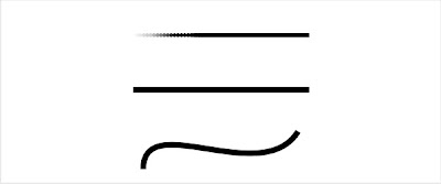
The point is the element of visual communication simpler there. It serves as an indication or reference point space. It is the element that has a power of visual appeal to the eye, ie, where it is, draws the human eye, forcing him to go into the symbol drawn.
Two points are used to plot a measure of space for development a visual design, even a simple line made with a ruler. 
When the points are seen together, they bind, having the ability to turn our gaze towards the direction you want. Since when are united and in large numbers, creating the illusion of tone and color. 
When the points are so close that there is no way to see them separately, comes another kind of visual element, which is ....

 Line

The line has a great energy. It is the visual element restless, a moving point. The lines are used as an outline, what gives rise to something that has not yet been developed. It is the most important element of the drawing. 
It is based on a sequence of lines which arise following the element ...


Form

There are three basic shapes: square - the square are associated with characteristics such as honesty, dedication and balance; Circle - The circle represents infinity and protection, Triangle - Have the equilateral triangle gives us the feeling of action, conflict and tension. All basic forms are simple, but can be constructed as described and easy.From these three forms are all other compounds.


Direction

All forms express some direction. 
The basic directions are: Vertical and Horizontal - Square Diagonal - Triangle Curve - Circle The direction vertical / horizontal is a sense of balance; The diagonal represents stability, have the curves represent the repetition.


Tone

The margins used to create the quick sketch, they overlap, creating the shading of the image, thus making use of tones. 
tones are seen from the presence or absence of light, overlapping the colors of the design done.

Color
 
Hue or color chroma is in itself, as is the saturation on color purity. Brightness is the relative brightness, ranging from light to dark, or which gives the change of tone color.

The color is of great importance for the visual communication at all with it comes the information necessary for a form or typesetting. All colors have a relative significance and symbolic. 
There are three main basic hues: Yellow - Closer to light and heat - Red and emotional Turns Blue - Blue is passive and gentle These three colors mixed together create new colors, and with them appear on new meanings. The color has a meaning more emotional than all other elements, it is used to express a feeling or idea.

Dear Lucia

All theories remain valid but Bioptical Art
introduces additional the effects

Psychophysical mixture of colors, retinal cooperation, antispace in art, spatial harmony, bispace in art, psychic cycle, dynamics of space depth, spatial disharmony, hyperrealistic effects, hiatus in art, visual gradient, hyperspace in art, field binocular rivalry.

RSS

© 2024   Created by Dr. Krishna Kumari Challa.   Powered by

Badges  |  Report an Issue  |  Terms of Service